The first impression sets the expectation.
Long before your guests arrive, before the music begins and the tables are set, they experience your wedding for the first time through an envelope placed in their hands.
The paper. The calligraphy. The impression of letterpress. The weight of the invitation. The smallest finishing details. Together, they offer the first glimpse of what is to come.
An invitation does more than communicate a date and a place. It establishes a sense of occasion. It introduces the atmosphere of the celebration and creates anticipation for everything that follows.
Thoughtfully personal. Entirely bespoke.

CALLIE AND JACK
An Expression of Timeless Elegance
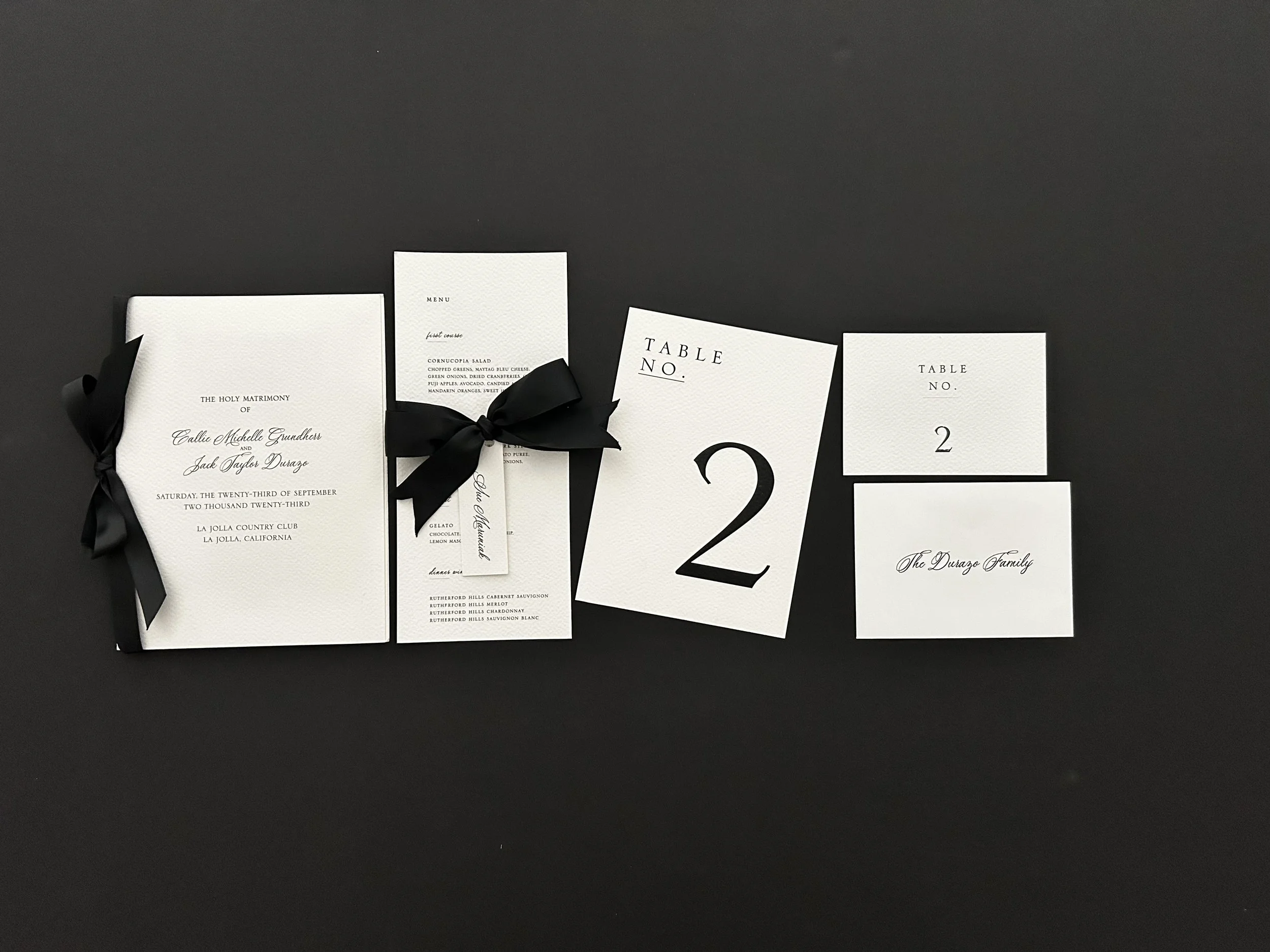
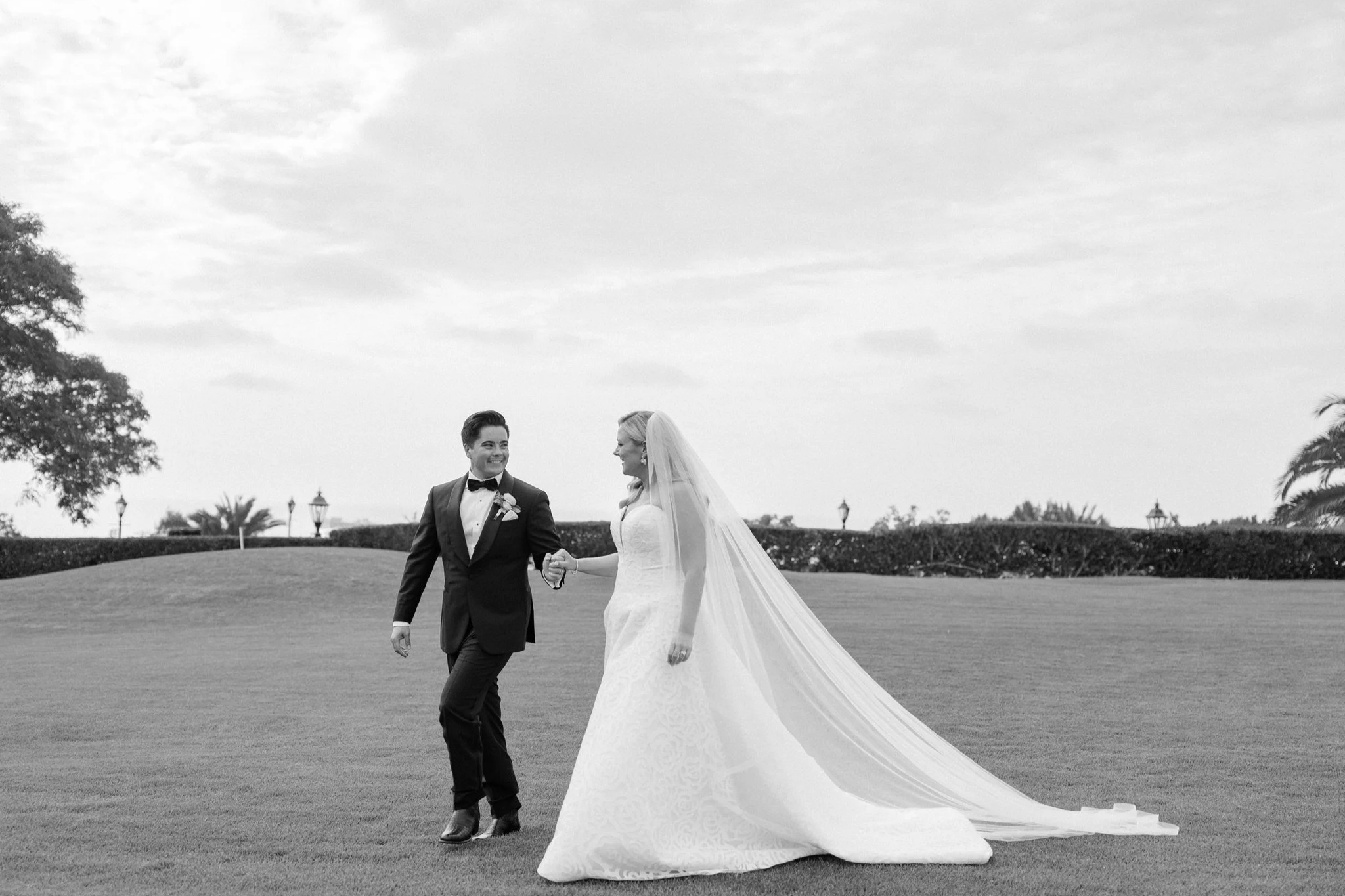
Rooted in tradition and defined by a classic black and white palette, Callie and Jack’s collection was the introduction to a wedding of enduring sophistication.
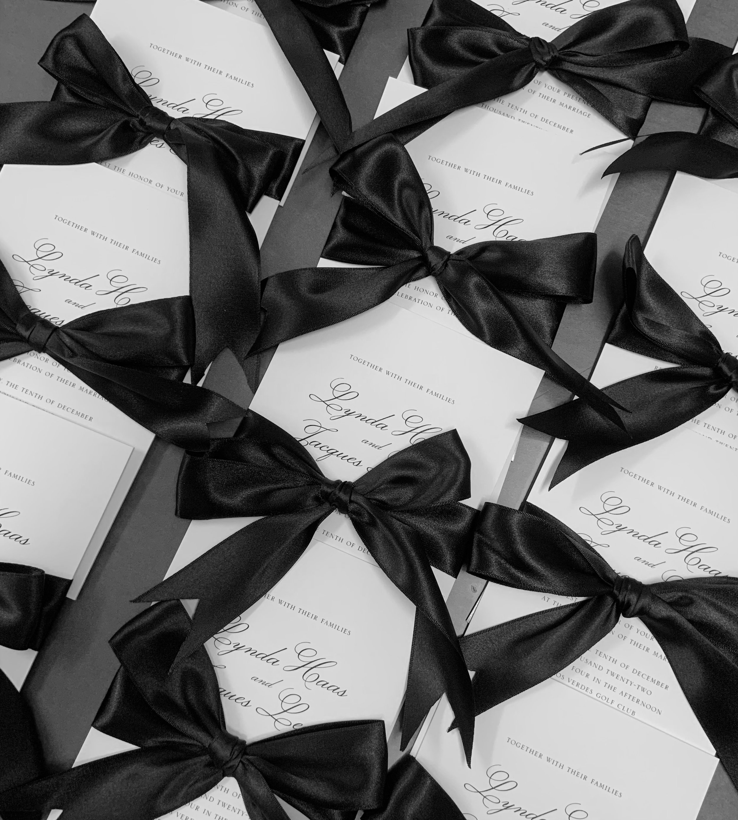
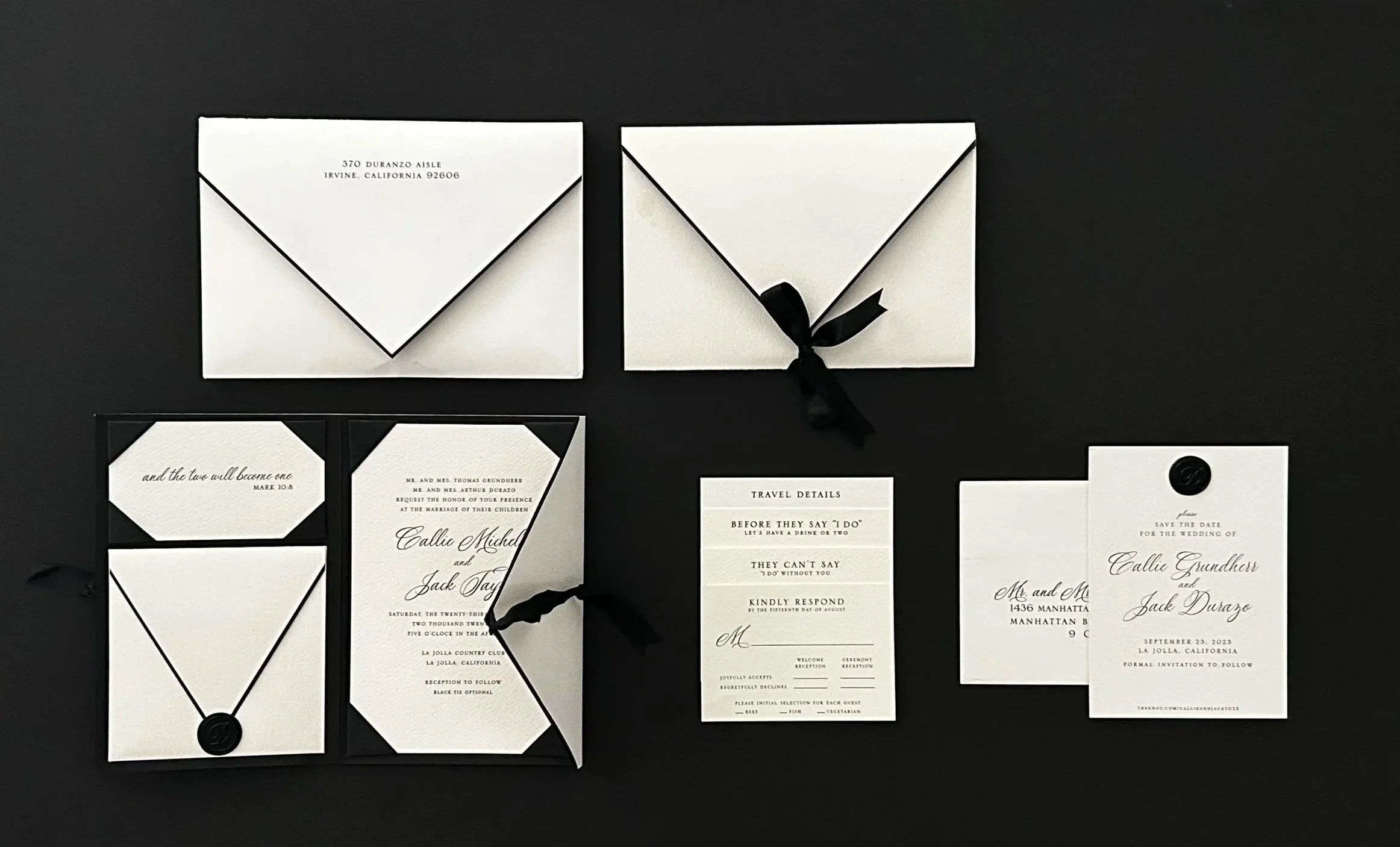
The invitation suite is a striking study in restrained design, printed on ultra-premium, heavy watercolor paper and beautifully oversized to make an unforgettable, commanding statement. Featuring sharp architectural lines and tailored black ribbons, each piece was conceived as part of a cohesive collection, setting an impeccable standard for the celebration to follow.
THE FINER DETAILS
A Study in Craftsmanship
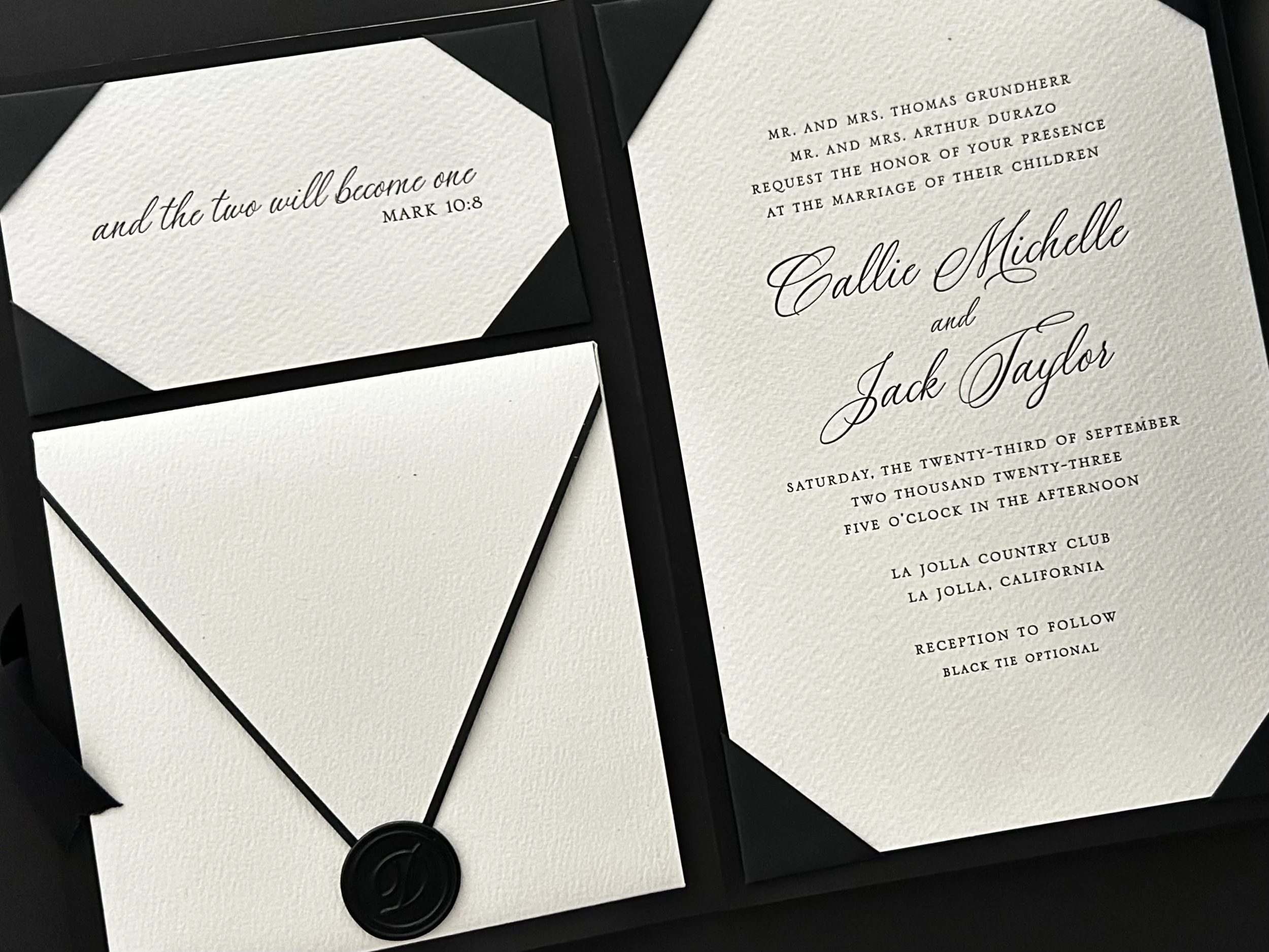
At the heart of the collection was a bespoke invitation, letterpress printed on duplexed fine art watercolor paper and presented within an elegant gatefold. A substantial custom outer envelope and custom inner details envelope extended the tailored construction, while double-faced satin ribbon and a wax seal added dimension to the restrained black and white palette.
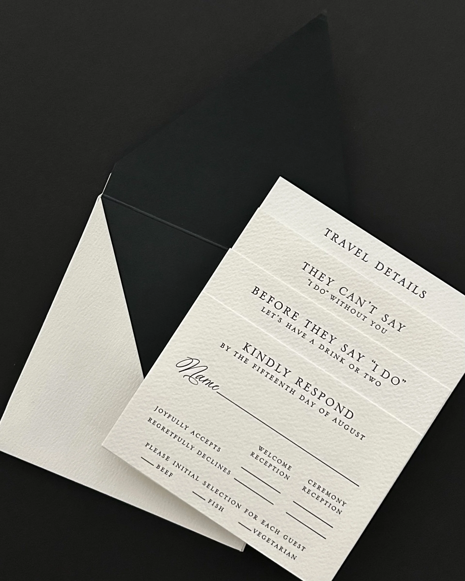
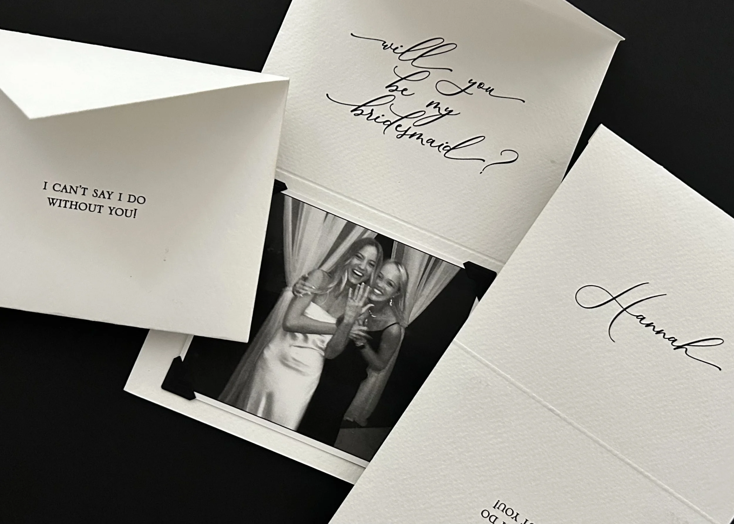
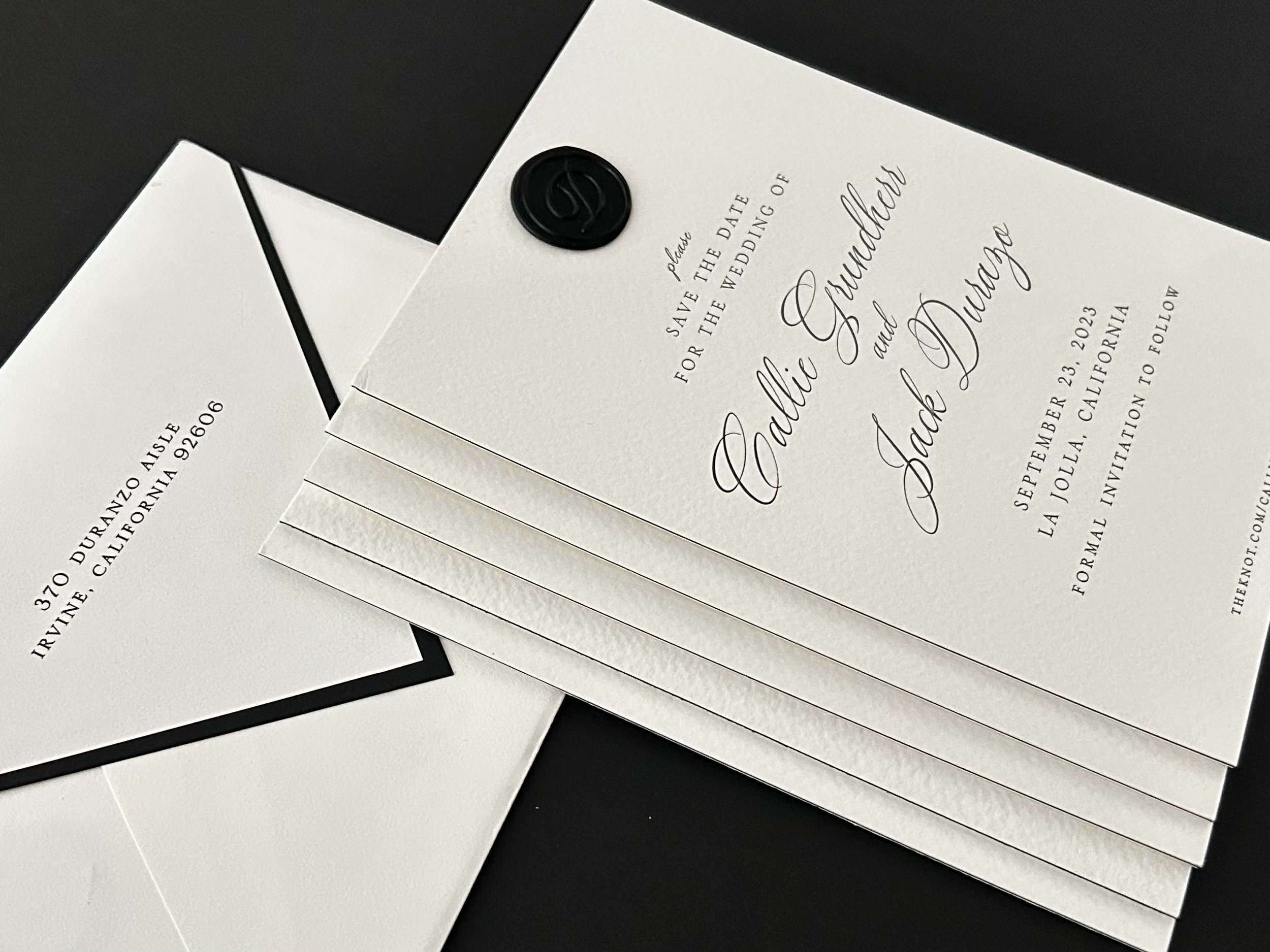
The material language began with the bridesmaid proposals and continued with the Save the Date, where black and fine art watercolor papers were layered to create a subtle graphic contrast that would carry through the stationery to follow. Each piece was individually conceived while remaining unmistakably part of the whole.
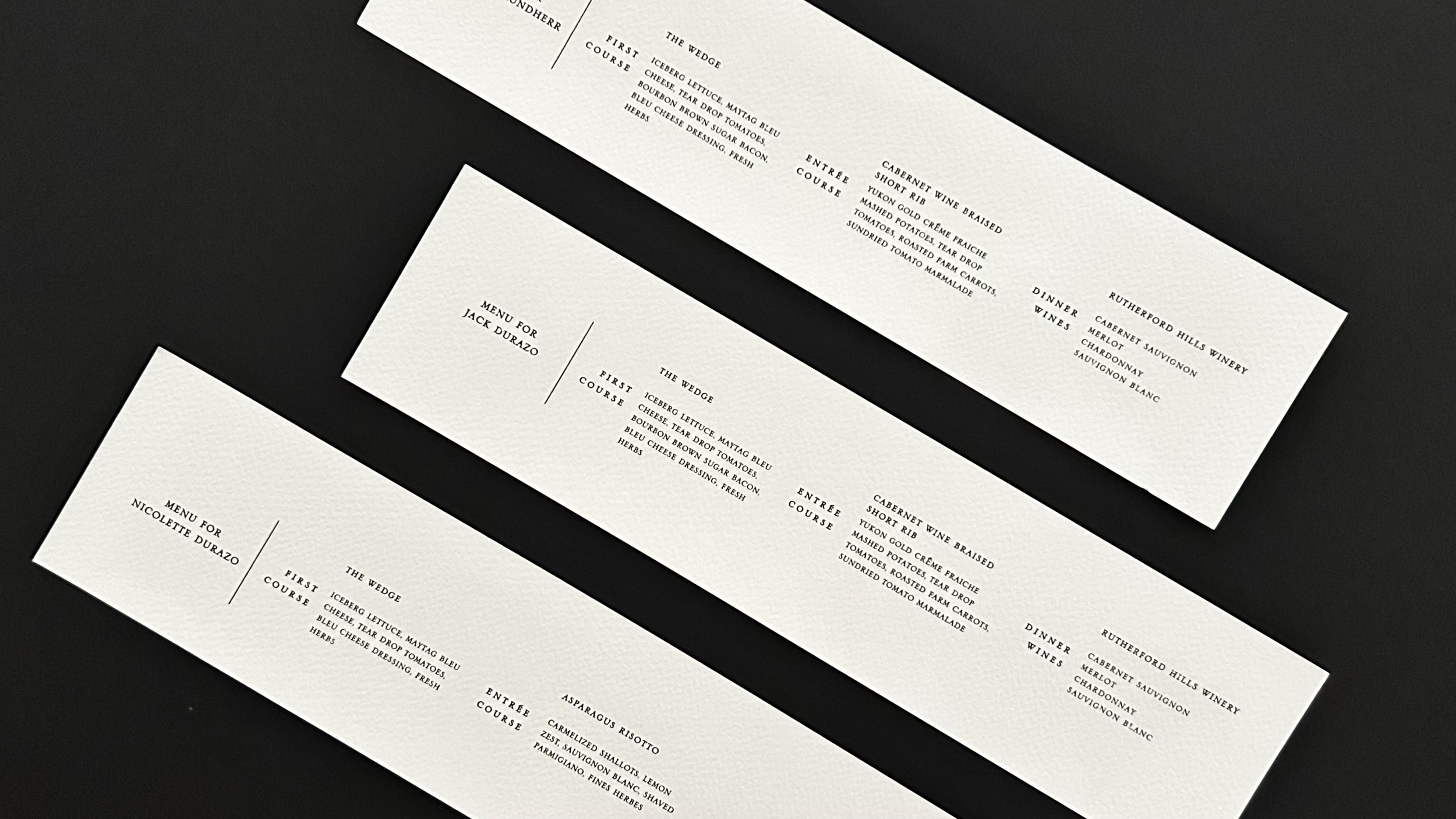
Personalized menus were created for both the rehearsal dinner and reception, incorporating each guest’s individual meal selections. On the wedding day, individually addressed envelopes were displayed for guests to retrieve, each containing a personal thank you card and seat assignment.
HAILEE AND ANDY
Where Southern Grace Meets Ocean Waves
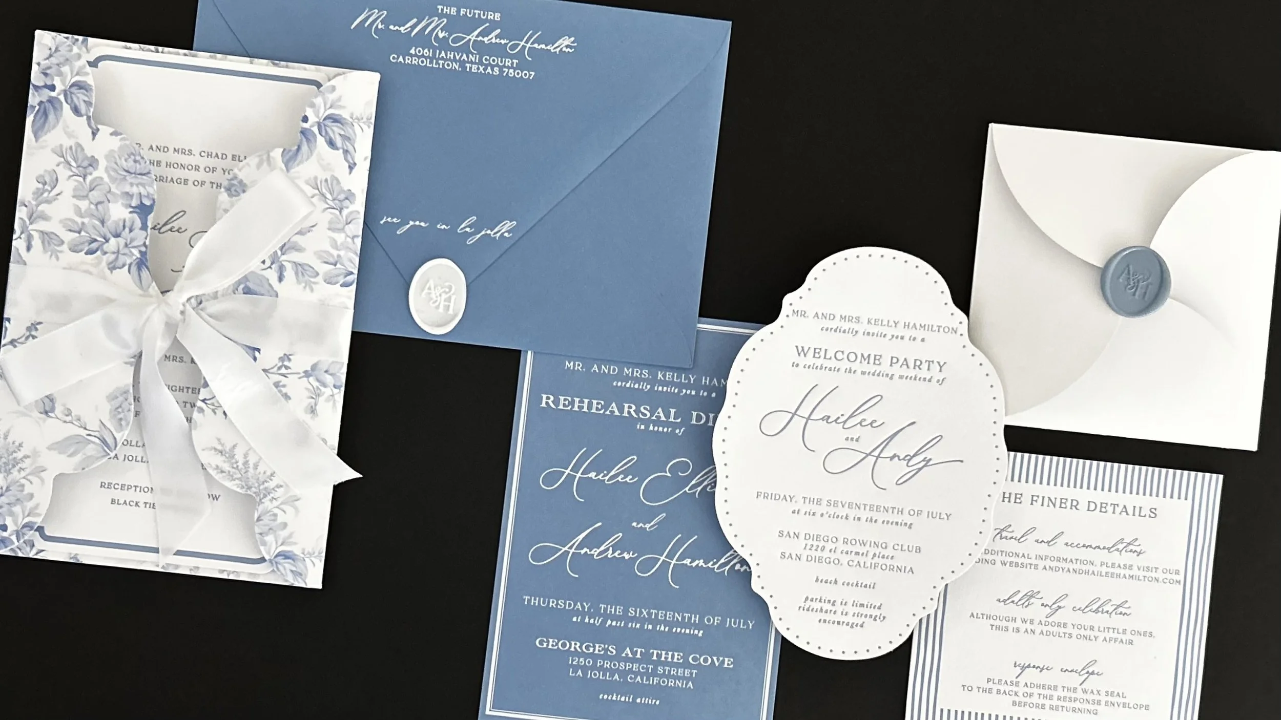
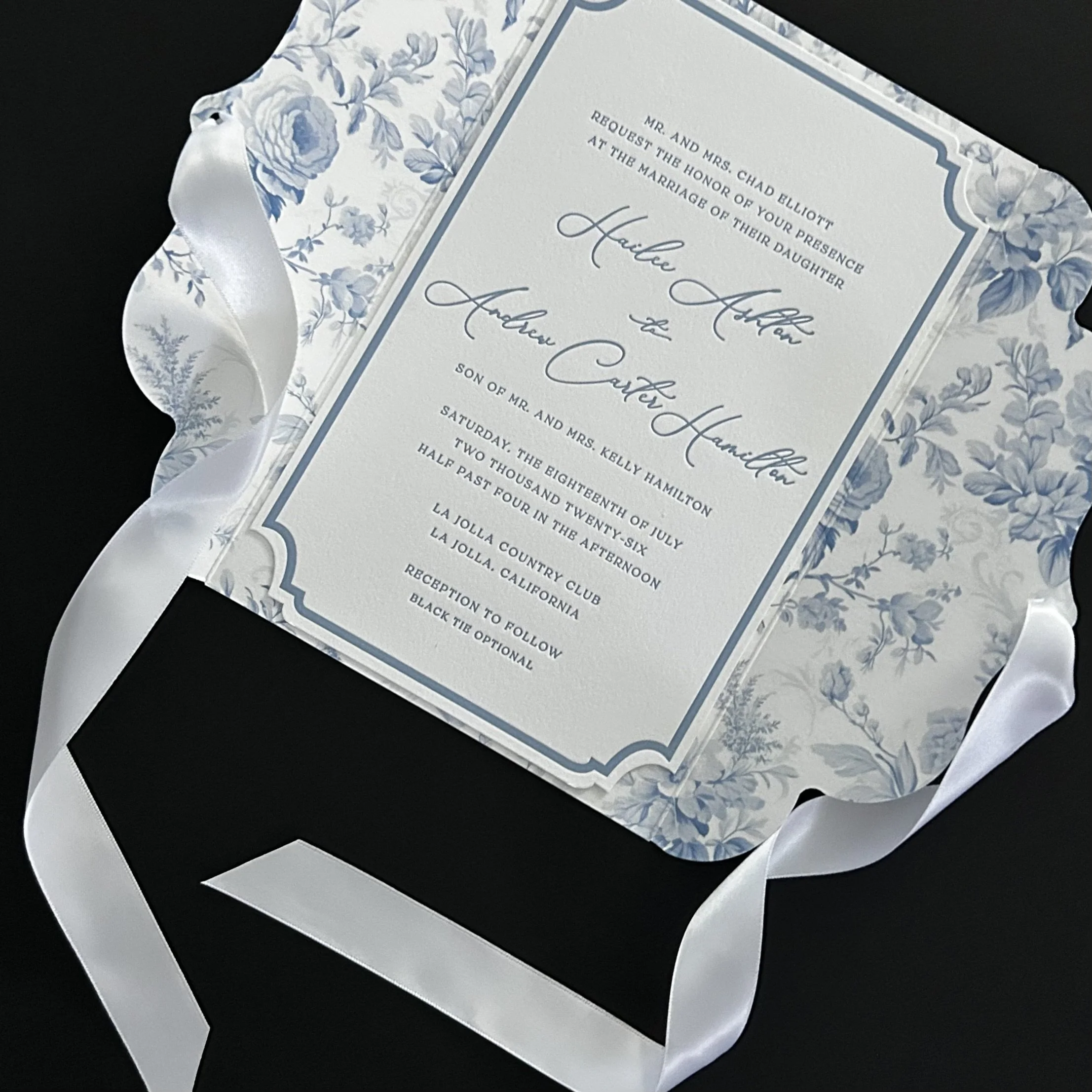
Hailee and Andy’s collection offered a playful introduction to a wedding weekend in La Jolla, balancing unexpected shapes and layered patterns with a beautifully restrained palette of blue and white.
From delicate florals and stripes to vellum, ribbon and sculptural paper details, each piece revealed something a little different while remaining unmistakably part of the whole. The result was a collection filled with personality, refined, joyful and full of anticipation for the celebration to come.
THE FINER DETAILS
An Experience in Layers
From the first Save the Date to the final details of the wedding weekend, Hailee and Andy's collection was designed to unfold as an experience.
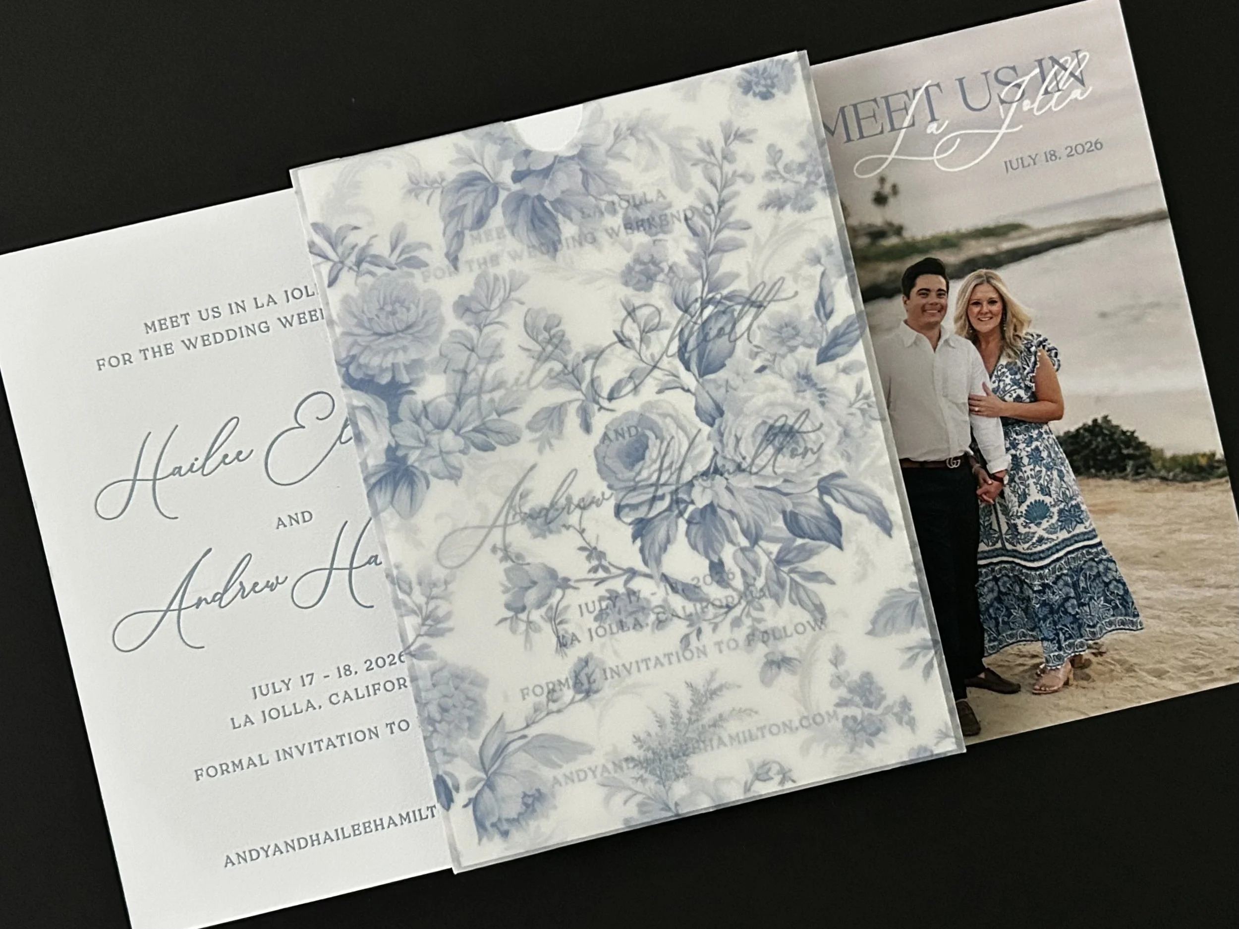
Guests first encountered the collection through a custom printed vellum sleeve, revealing a letterpress Save the Date on soft cotton Crane’s Lettra paper. Turning it over revealed a photograph of the couple, inviting their guests to “Meet Us in La Jolla.”
The invitation continued the sense of discovery with an illustrated gatefold wrapped in ribbon. Opening it revealed a custom blind letterpress sleeve bearing their custom monogram, with a collection of letterpress, die cut and foil printed pieces tucked inside, each introducing another moment of the wedding weekend.
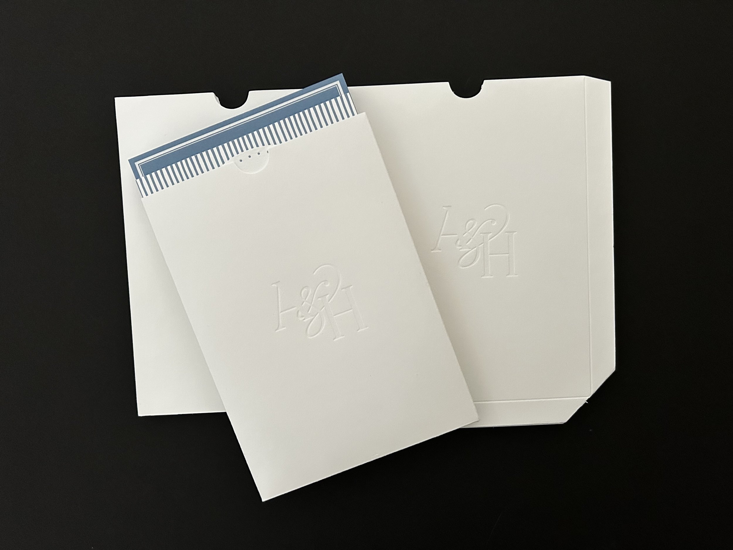
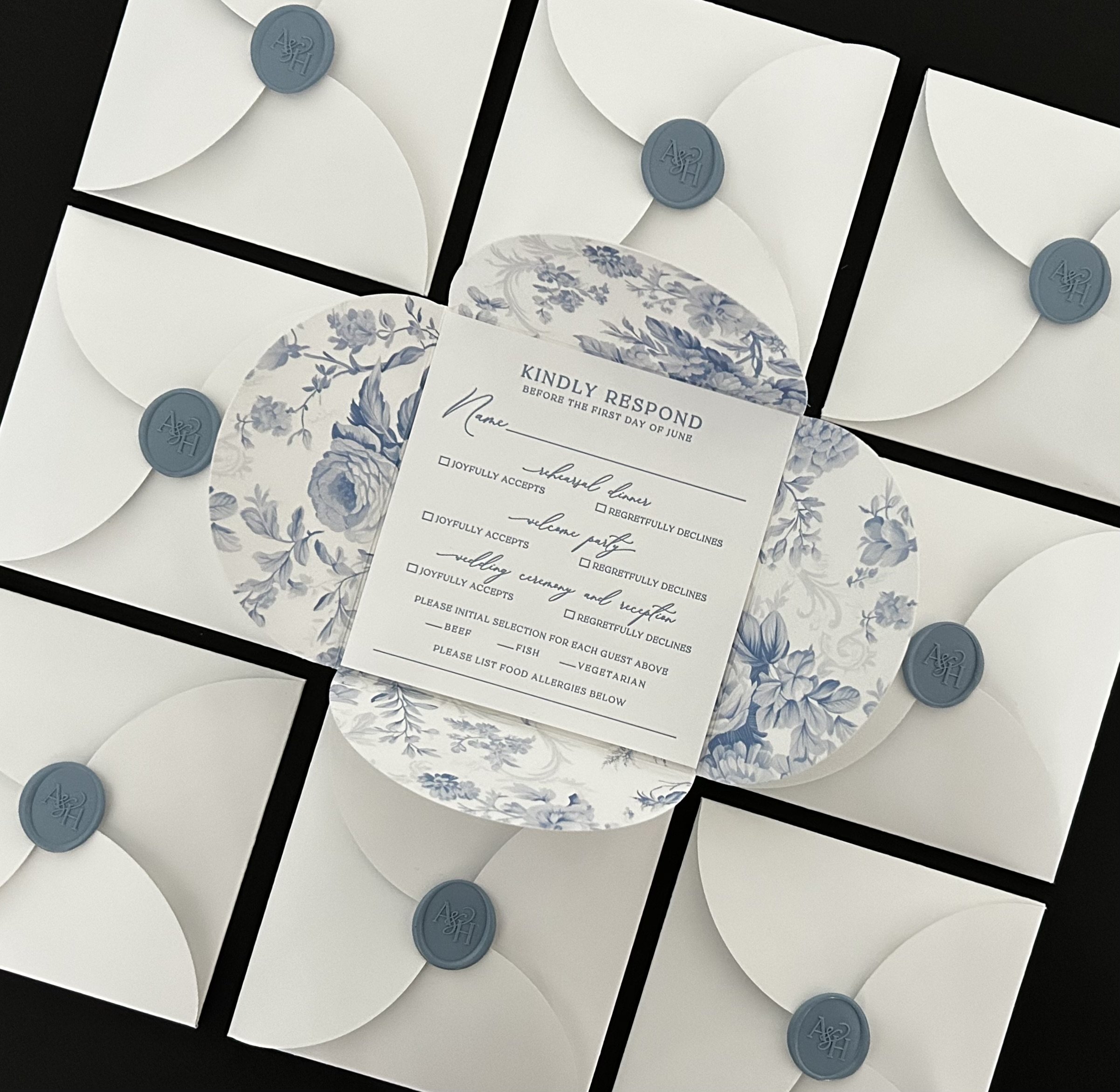
Even the response became a design moment of its own: a custom letterpress card and custom die cut petal envelope, finished with their monogram and mailed as a complete composition.
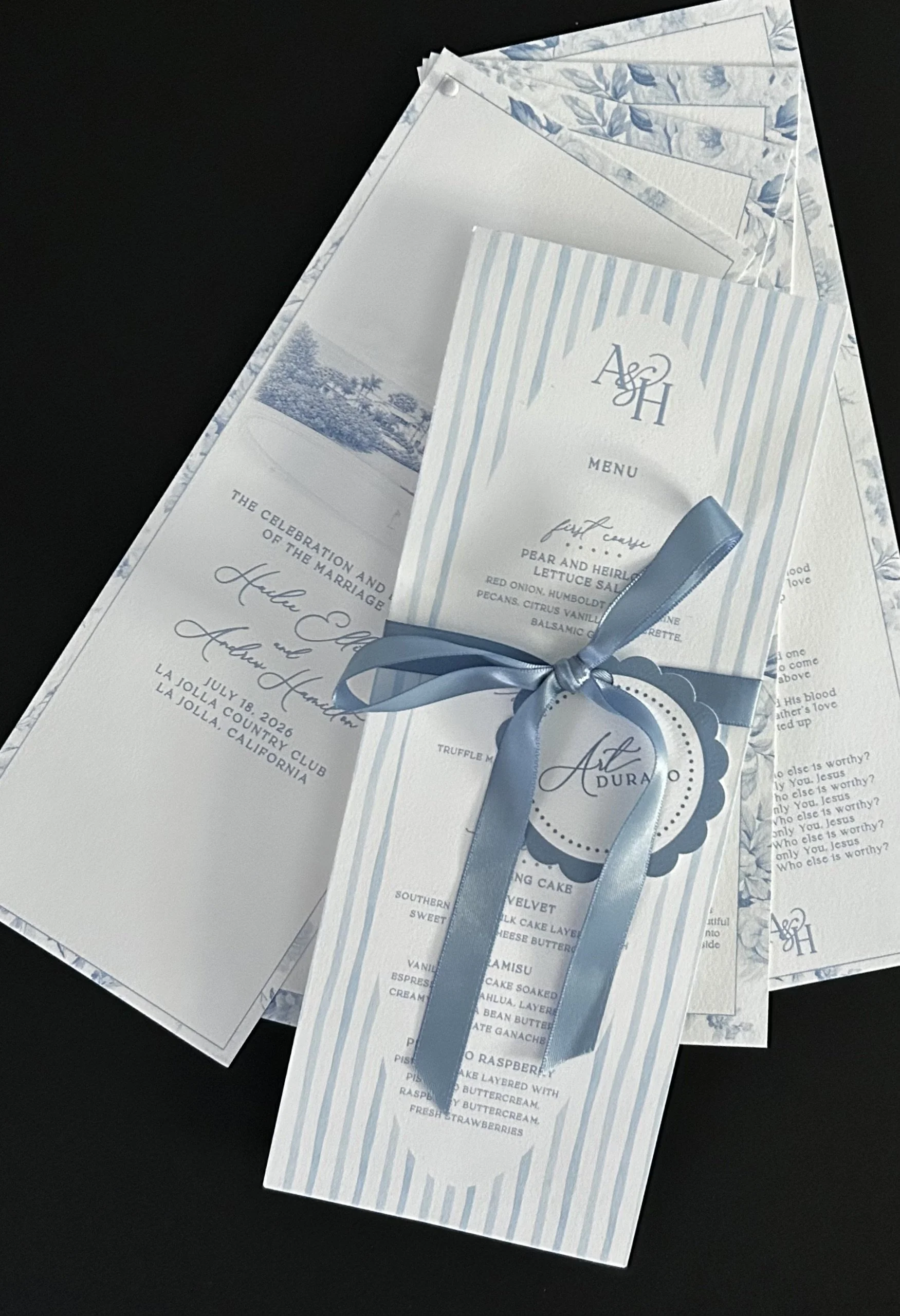
The collection continued into the wedding day with personalized menus incorporating each guest’s individual meal selections and a four-panel ceremony program, carrying the collection’s distinctive shapes, patterns and blue and white palette through the celebration itself.
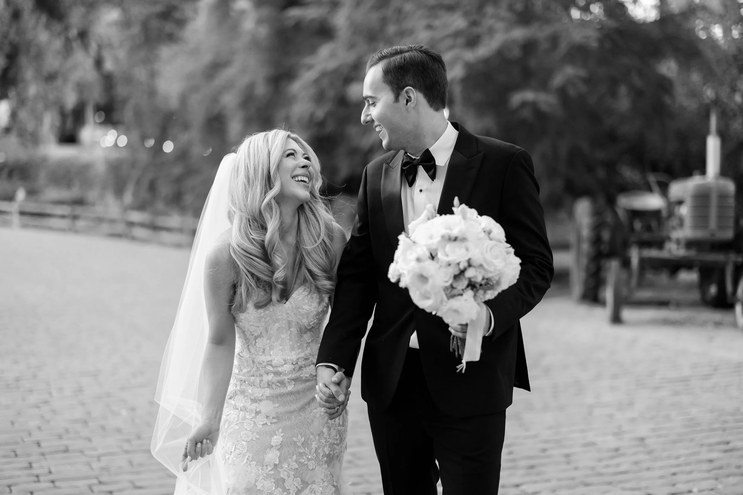
ERIKA AND NICK
Classic Romance, Beautifully Unwrapped
Erika and Nick’s collection was the perfect introduction to a wedding defined by refined elegance and understated romance.
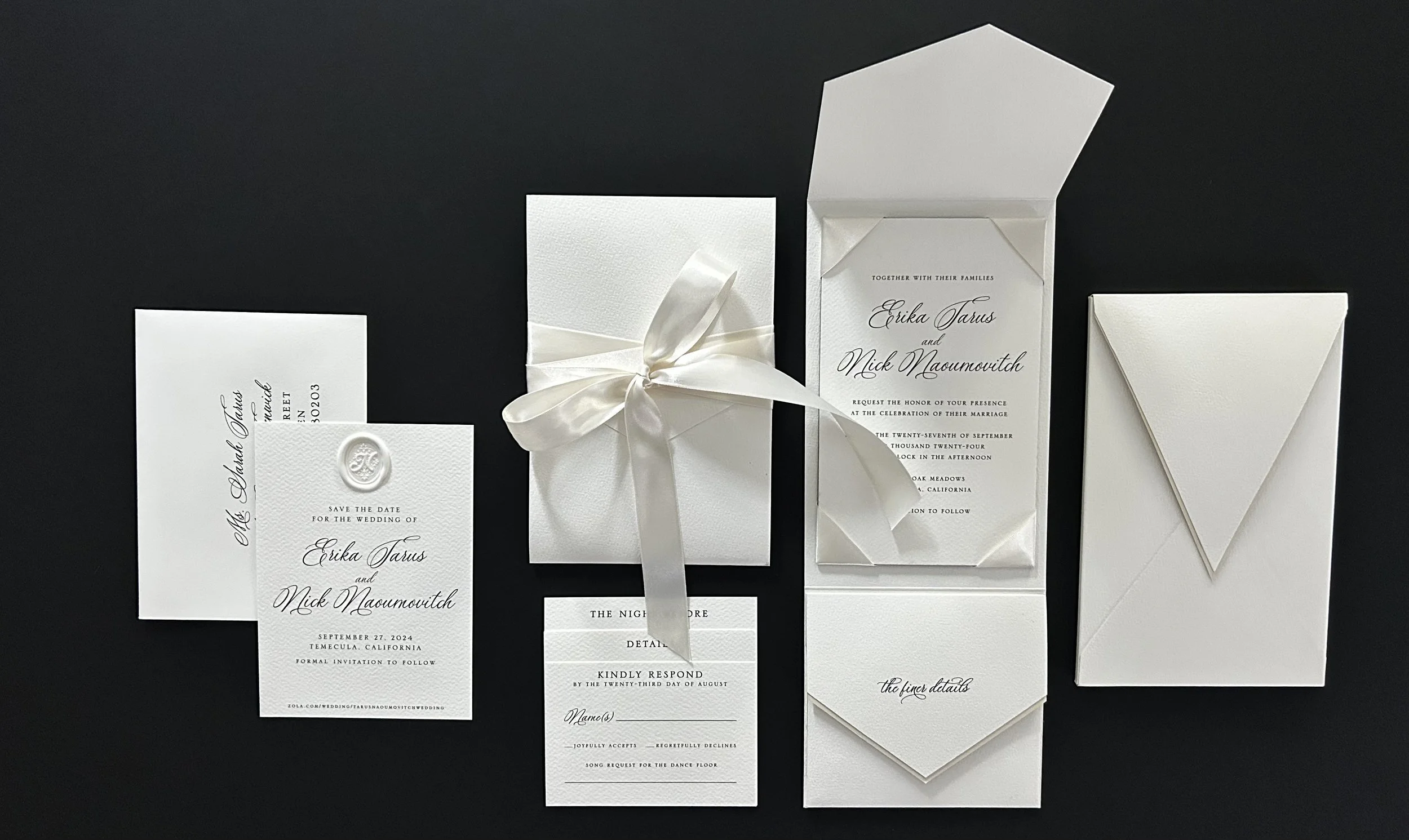
Working entirely in shades of white, the collection brought together luxurious fine art watercolor paper, soft satin ribbon and thoughtfully layered details. With color intentionally limited, texture, proportion and craftsmanship became the design, creating a collection that felt quietly romantic, beautifully tactile and entirely timeless.
THE FINER DETAILS
The Art of Restraint
The visual language is quiet; the construction is anything but simple.
A custom outer envelope offered the first glimpse of the suite, with its liner intentionally revealed along the edge and crafted from the same luxurious fine art watercolor paper used throughout the collection
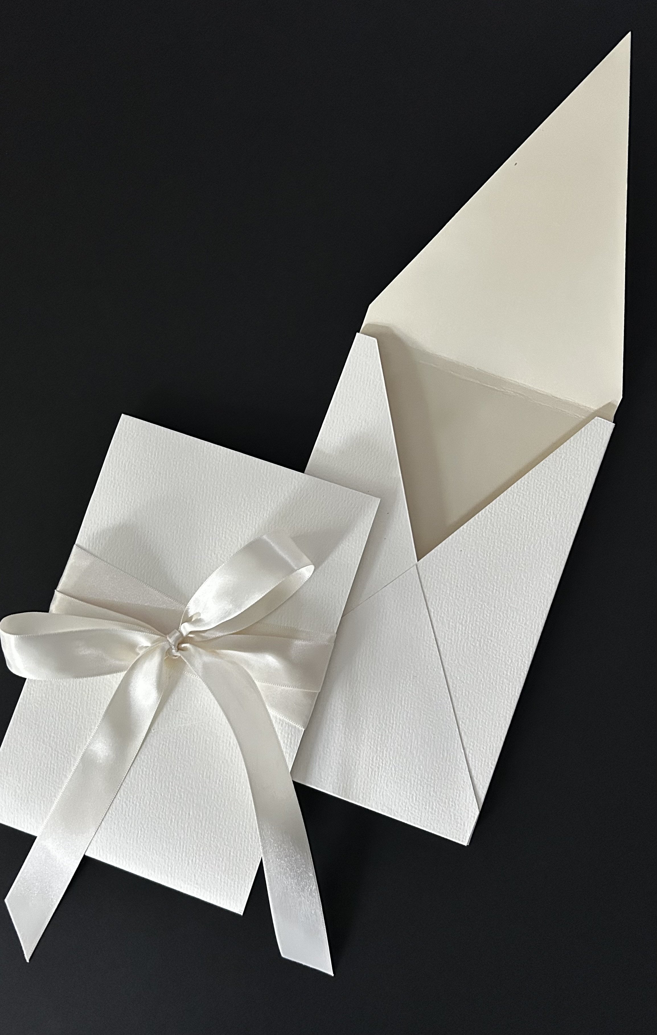
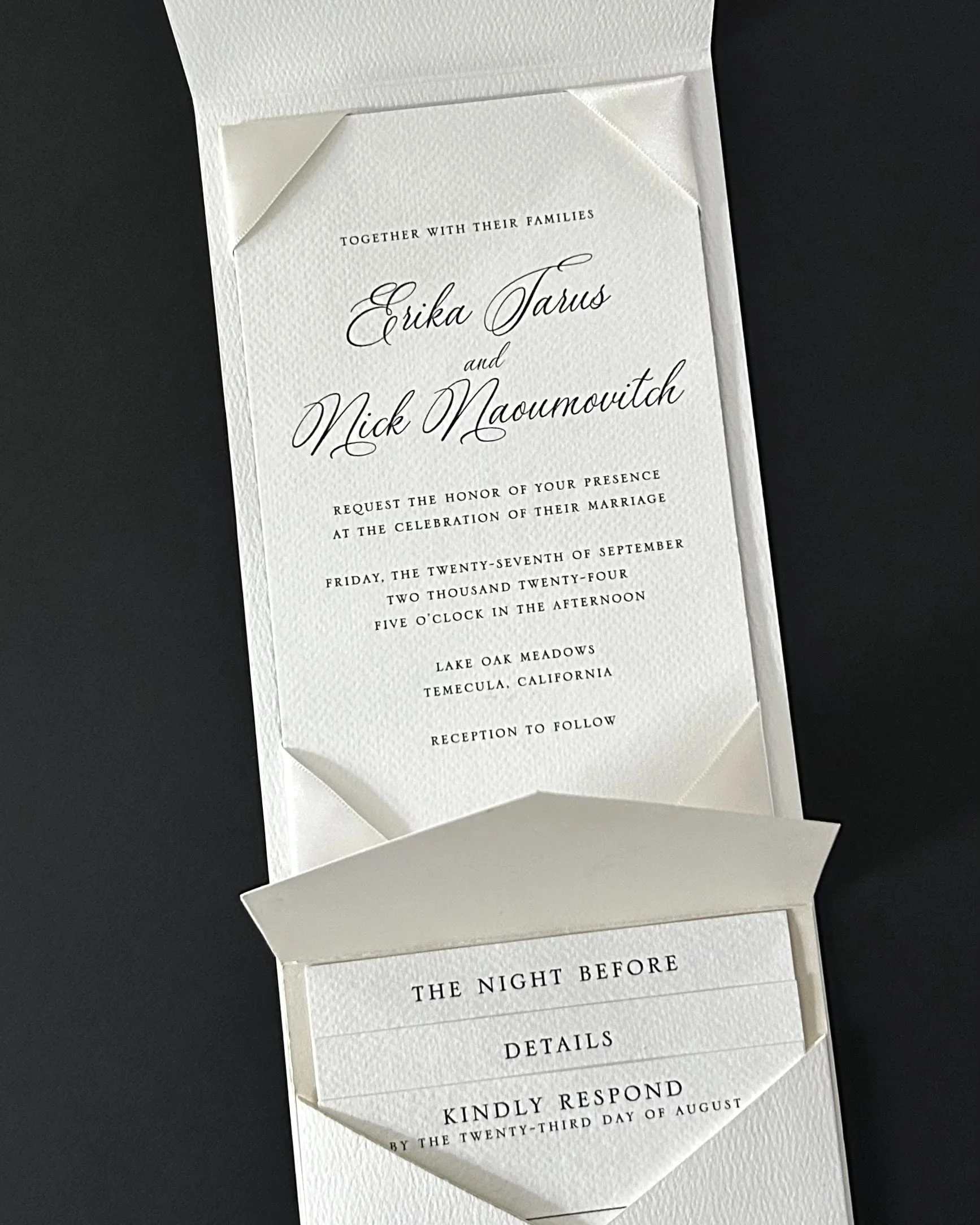
Inside, the custom inner envelope held a stepped arrangement of the weekend details, finished with a peekaboo liner. The invitation and inner envelope were presented within a tailored gatefold, secured with satin ribbon wrapped several times around the piece.
The invitation carried the ribbon detail one step further, with delicately wrapped corner accents adding dimension to an otherwise beautifully restrained design.
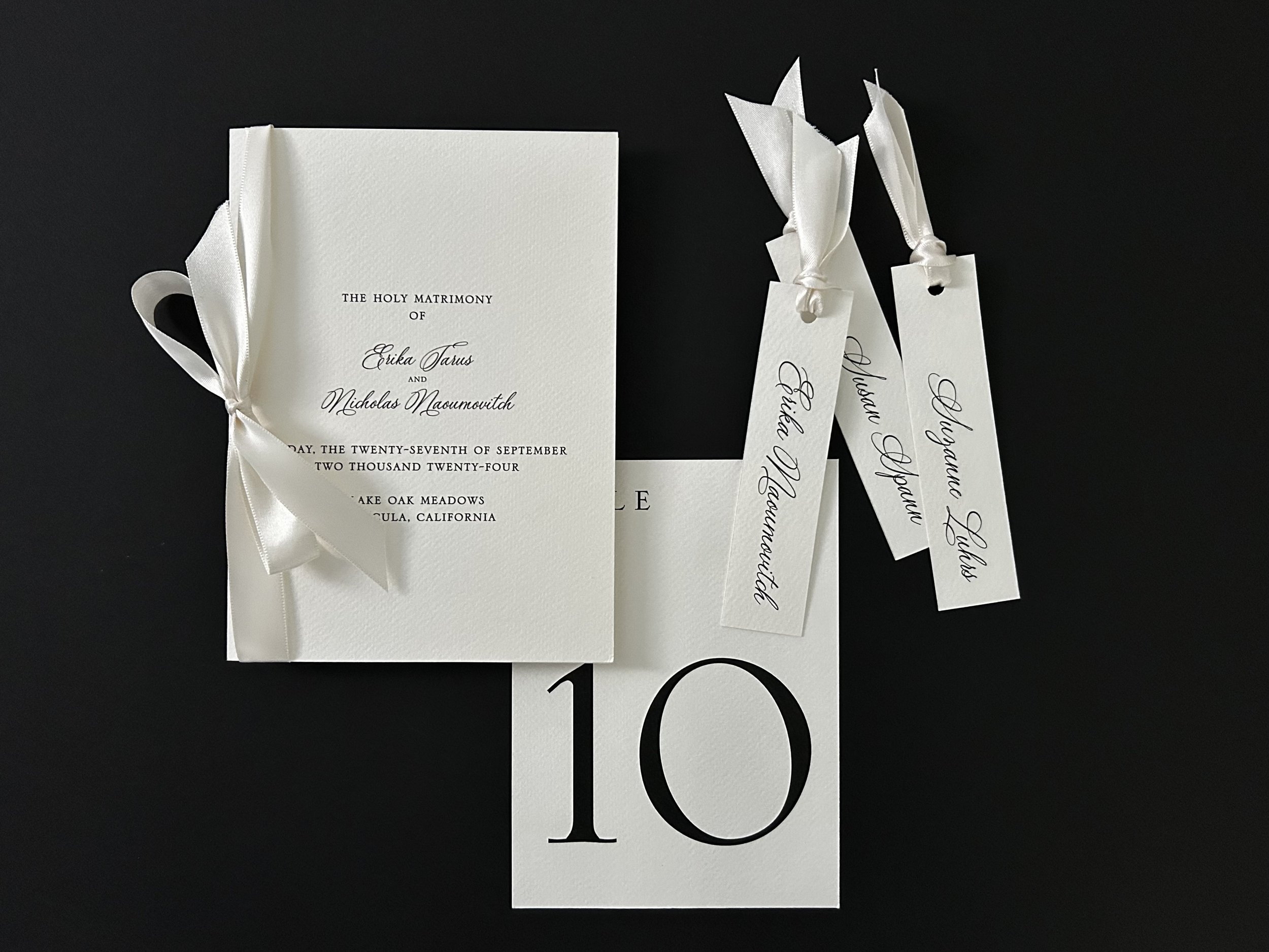
The collection continued into the wedding day with ceremony programs, oversized table numbers and individual place cards, carrying the same monochromatic palette and satin ribbon details from the invitation through the celebration.